Pivot Tables in Excel: A Complete Tutorial From Basics to Advanced
Want to follow along? Download a clean sample dataset and practise creating Pivot Tables, grouping dates, changing Value Field Settings, and adding slicers.
If you work with spreadsheets in the real world, chances are you have met the classic situation. Someone exports a large file from a system, sends it across with a cheerful message, and then asks a deceptively simple question such as “Can you show sales by region?”, “Which team closed the most tickets?”, or “What changed month by month?”
The data is there, somewhere, but the answer is not obvious from thousands of rows. This is exactly where Pivot Tables earn their reputation. They help Excel users summarise, reorganise and explore structured data quickly, without writing multiple formulas or rebuilding the report every time a stakeholder changes their mind.
This guide takes you through Pivot Tables from the basics to more advanced techniques. It is written for practical AU and NZ workplaces, so the examples and advice focus on reporting, analysis, and day-to-day business use rather than spreadsheet theatre for its own sake.
TL;DR: Pivot Tables are one of the fastest ways to summarise Excel data. Build one from a clean table, drag fields into place, then sort, filter, group dates, and change the value summary to answer the business question you actually care about.
The big win is speed and flexibility. Once the source data is organised properly, you can rearrange the summary in seconds instead of rebuilding the analysis every time someone asks for the same numbers “but by another category this time”.
1) What is a Pivot Table in Excel?
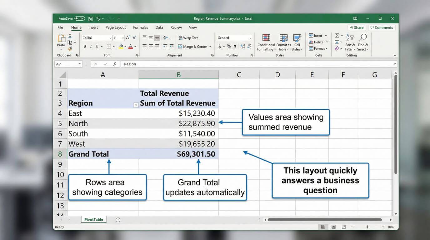
A Pivot Table is an interactive summary report built from a source dataset. Instead of looking at every record individually, you ask Excel to group and aggregate the data for you. That could mean summing revenue, counting transactions, averaging response times, or comparing activity across regions, products, teams, categories or dates.
The word “pivot” refers to the fact that you can rearrange the view easily. Put region in Rows and month in Columns. Then switch it. Put product in Rows and salesperson in Filters. Then switch it again. You are not changing the raw data. You are changing how the summary is presented.
This makes Pivot Tables especially useful for management reporting, ad hoc analysis, operational summaries, finance packs, and quick investigations when stakeholders want answers faster than a formula-heavy worksheet can reasonably deliver.
Practical definition: a Pivot Table is not a new dataset. It is a flexible summary view of existing data, designed to help you answer business questions quickly.
- Summarising large datasets quickly
- Comparing categories and periods
- Counting, summing and averaging values
- Filtering reports for specific audiences
- Supporting charts and dashboards
- Highly unstructured spreadsheets
- Messy data with merged cells and subtotal rows
- Very specific custom row-by-row logic
- Replacing basic data preparation entirely
- Reading your stakeholder’s mind, regrettably
2) Before you start: set up the source data properly
Most Pivot Table issues begin before the Pivot Table exists. If the source data is poorly structured, your report will be less reliable and harder to maintain. Good source data does not have to be glamorous, but it does need to be consistent.
Ideally, your source should have one header row, no blank columns in the middle, no merged cells, no manually inserted subtotals, and consistent data types in each field. Dates should be real dates. Amounts should be real numbers. Categories should be spelt consistently.
If your team often receives awkward exports with inconsistent headings, broken dates or repeated clean-up steps, it is worth looking at Microsoft 365 training and Excel workflows more broadly so that reporting, collaboration and data handling are more consistent across the business. For users specifically improving spreadsheet analysis, Nexacu’s Excel Intermediate course is a practical place to strengthen Pivot Table skills.
3) Step-by-step: how to create a Pivot Table in Excel
Here is a straightforward workflow that works well for most business datasets. You may not need every option straight away, but this will get you from raw data to a useful summary quickly.
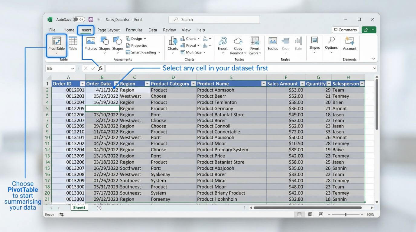
Excel needs to identify the range or table you want to summarise. If the data is already formatted as an Excel Table, even better.
This helps Excel capture the full dataset accurately and makes later refreshes less painful.
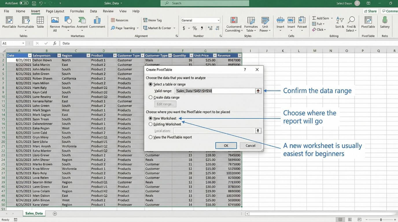
Excel will suggest the source range. Check that it is correct, then choose whether the Pivot Table should be created on a new worksheet or an existing one.
A new sheet is usually easier when you are learning because it keeps the report separate from the raw data.
The fields pane shows all available columns from the source data. Underneath, you will see the four key layout areas: Rows, Columns, Values and Filters.
This is where the Pivot Table becomes useful. The answer depends on where you place each field.
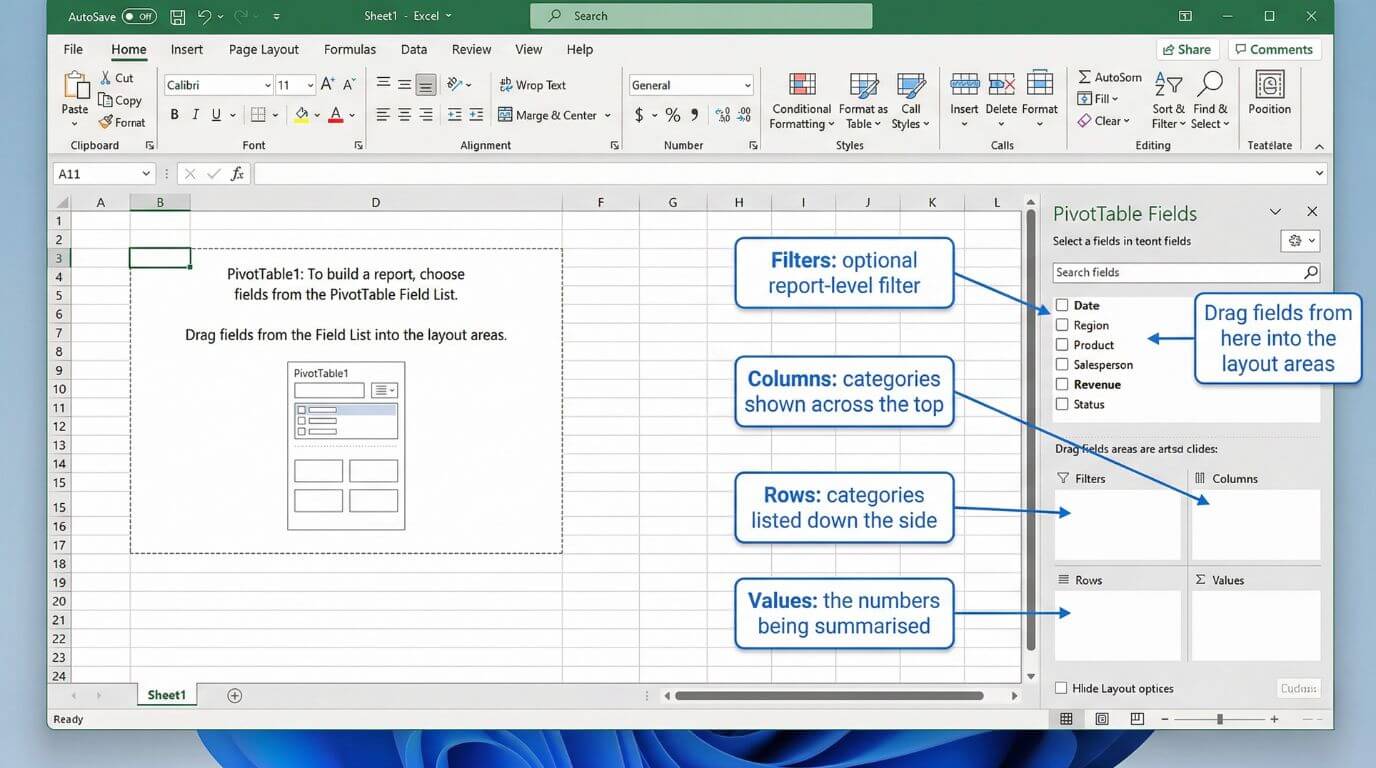
Put fields such as state, team, product, or department into Rows. Put dates or categories you want compared across the top into Columns.
If you are unsure, start simple. For example, place Region in Rows and Revenue in Values. Once you see the result, adjust from there.
This is the field Excel will summarise. It might be revenue, units, cost, duration, or simply a record identifier if you want a count.
Excel often defaults to Sum for numeric fields and Count for text. That is usually helpful, but always check the result before trusting it blindly.
Filters are useful when you want the whole report limited by one field, such as year, business unit, office or status.
This can be handy when sharing a report with different managers who each need a filtered view of the same dataset.
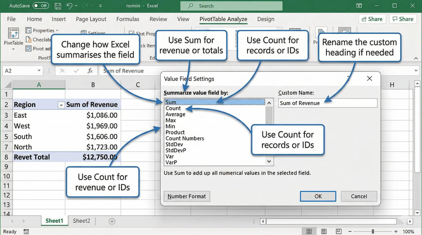
Right-click a value in the Pivot Table and choose Value Field Settings. Here you can switch between Sum, Count, Average, Max, Min and other calculations.
This matters because the right field in the wrong summary can give a technically correct answer to the wrong question.

Apply currency, percentage or number formatting as appropriate. Rename value fields to something clearer than “Sum of Revenue” if that suits your audience.
Clear formatting makes a big difference when the report is being used beyond your own screen.
You can sort largest to smallest, filter to selected items, or group date fields into months, quarters and years. This is where a basic summary starts becoming a useful report.
Grouping is especially helpful when raw data contains many individual dates but the audience wants a cleaner monthly or quarterly view.
Pivot Tables do not always update automatically. Right-click the report and choose Refresh, or refresh all data connections in the workbook.
This becomes especially important in recurring reporting processes where the source data is updated regularly.
4) Useful Pivot Table features for everyday reporting
Once the basic report is built, a few features make Pivot Tables much more practical in day-to-day business use.
These are the features that often turn a good spreadsheet into a genuinely useful reporting tool for managers, analysts and team leads.
Quickly identify top performers, low-value categories, or a shortlist of items that matter for a meeting or review.
Turn long lists of daily transactions into month-by-month or quarter-by-quarter summaries without touching the source data.
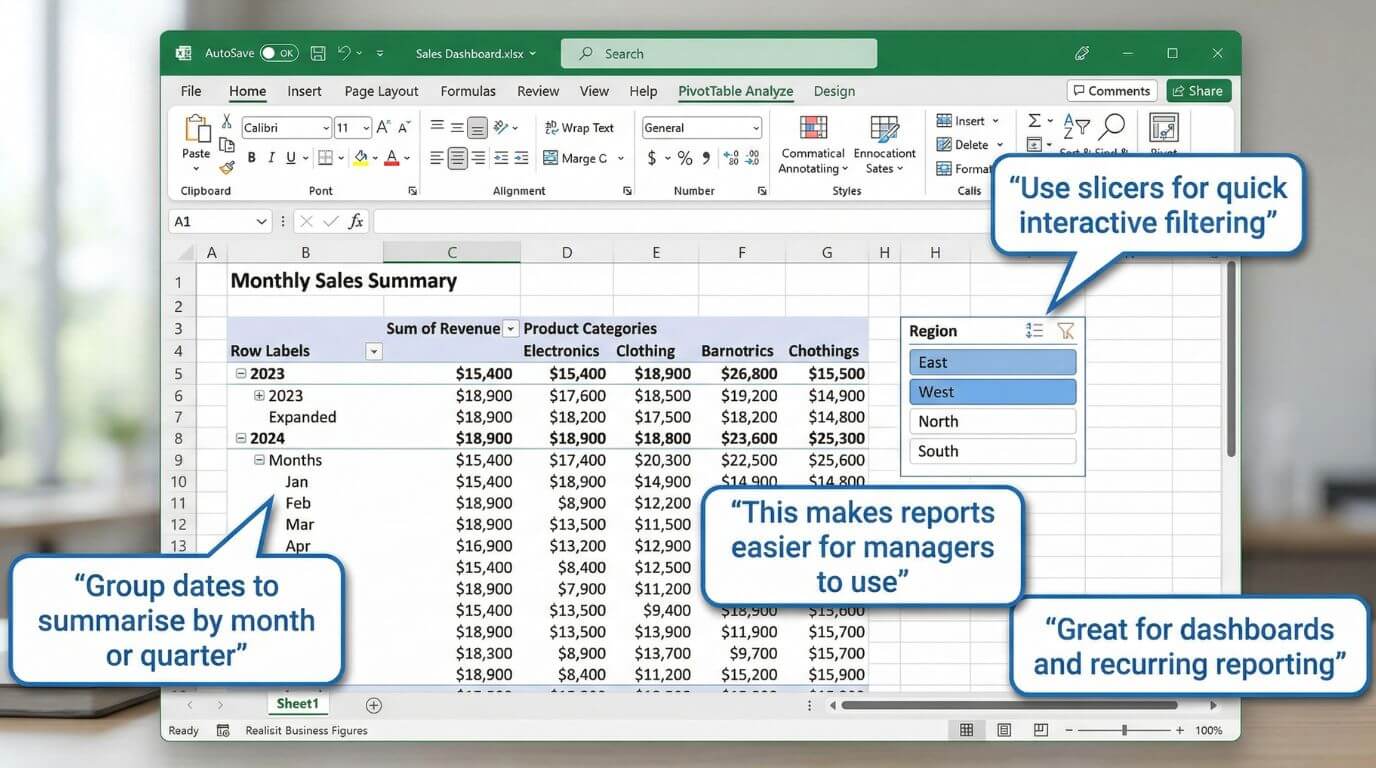
Add clickable filters that make reports easier for non-technical users to interact with during meetings or reviews.
Create charts linked to the Pivot Table so changes in filters or layout flow through to the visual automatically.
Group dates step by step
Grouping dates is one of the most useful Pivot Table features because raw transaction data is often too detailed for reporting. A daily list of sales or support activity is useful at source level, but managers usually want to see trends by month, quarter or year.
To group dates in a Pivot Table:
- Drag your Date field into Rows or Columns.
- Click any date inside the Pivot Table.
- Right-click and choose Group.
- Select the time periods you want, such as Months, Quarters or Years.
- Click OK and review the grouped result.
A good starting point is to group by Months and Years together. This gives you a cleaner reporting view without flattening all dates into one long monthly list. It is especially useful when you are comparing results across multiple years.
If grouping does not work, the problem is usually in the source data. Excel can only group proper date values. If the date column contains blanks or text pretending to be dates, grouping will fail until the source is cleaned.
Add slicers step by step
Slicers make Pivot Tables much easier to use, especially for managers or stakeholders who want to filter a report without opening field dropdowns. They act like clickable visual filters and are excellent for recurring reports or simple dashboards.
To add a slicer:
- Click anywhere inside the Pivot Table.
- Go to the PivotTable Analyse tab in the ribbon.
- Choose Insert Slicer.
- Tick the field you want to filter by, such as Region, Status, Channel or Product.
- Click OK and position the slicer beside the report.
- Use the slicer buttons to filter the report instantly.
For example, a sales report might include slicers for Region and Channel so a team leader can switch between NSW, VIC or WA, then narrow again by Direct, Web or Referral. The report stays readable, and the filtering experience is much cleaner than relying on nested menus.
If you are building a more polished reporting view, slicers are often the point where a plain Pivot Table starts turning into a practical dashboard.
In Microsoft 365 environments, these summaries often sit inside broader workflows. Teams may discuss results in Microsoft Teams, store the workbook in SharePoint, and use Microsoft Copilot to help draft commentary or follow-up actions around the numbers. The Pivot Table remains a core reporting layer inside that broader ecosystem.
5) Advanced Pivot Table techniques worth learning
If your goal is to move beyond basic summaries, Pivot Tables have several advanced features that are genuinely worth learning. These tools help you build cleaner reports, pull values into other parts of the workbook, and work with more flexible data models.
GETPIVOTDATA for reliable report references
One of the most useful advanced Pivot Table skills is GETPIVOTDATA. This function pulls a specific value from a Pivot Table based on field names and item labels, which makes it much safer than pointing a formula at a random cell that may move later.
For example, if you want to display NSW revenue from a Pivot Table inside a dashboard card, a formula such as =GETPIVOTDATA("Revenue",$A$3,"Region","NSW") is more reliable than simply linking to cell B7. If the Pivot Table expands, collapses or gets rearranged, GETPIVOTDATA is far less likely to break.
This is particularly useful when building summary dashboards, KPI callouts or commentary blocks around a Pivot Table.
Custom grouping beyond simple dates
Most users know that dates can be grouped into months or quarters, but Pivot Tables can also support custom grouping for categories. For example, you might manually group several products into “Core Courses” and “Specialist Courses”, or combine states into broader regions for executive reporting.
To create a custom group, select the items inside the Pivot Table, right-click, and choose Group. Excel will create a new grouped field that you can rename. This is handy when the source system does not provide the exact reporting categories you need.
Used carefully, custom grouping helps turn operational data into business-friendly reporting categories without editing the original source file.
Show Values As for comparative analysis
Advanced reporting often needs more than a plain total. Under Show Values As, Pivot Tables can display values as a percentage of grand total, percentage of row total, running total, rank, or difference from another period. This gives more context without writing separate formulas.
For example, instead of showing just monthly revenue, you can show month-on-month difference or percentage contribution by category. That is often more useful in management reporting than totals alone.
Calculated fields and drill-down analysis
Calculated fields let you create simple formulas inside the Pivot Table structure. They are useful for lightweight derived measures, such as a simple margin or variance. Double-click drill-down is also extremely useful, because it lets you jump from a summary total to the underlying records behind that number.
That means if a manager asks why one month looks unusual, you can go from the summary straight to the supporting transactions in a few clicks.
A brief note on Power Pivot and the Data Model
For more advanced Excel analysis, it is worth knowing that Pivot Tables can also be built from Excel’s Data Model using Power Pivot. This becomes useful when you need to work with multiple related tables, larger datasets, or measures that go beyond standard Pivot Table calculations.
You do not need Power Pivot for everyday Pivot Table work, but it is part of the reason “advanced Pivot Tables” can mean more than rearranging a single list. It opens the door to relational modelling, more scalable reporting, and more sophisticated analysis inside Excel.
If your team is moving in that direction, Nexacu’s Analysis & Dashboards course is a practical next step because it extends beyond basic summaries into stronger reporting design and analysis workflows.
6) Quick fixes for common Pivot Table problems
Pivot Tables are reliable, but a few common issues appear again and again. Most of them are easy to fix once you know where to look.
The source field probably contains text, blanks or inconsistent values. Clean the data and check the value field settings.
Refresh the Pivot Table. Better yet, use an Excel Table as the source so added rows are easier to include.
Some entries in the date column are probably text or blank. Fix the source so Excel recognises them as real dates.
Use report layout options, consistent number formatting, better field names and clear filters so the summary reads more like a report and less like an accident.
Problem: I can see “(blank)” in my Pivot Table labels
This usually means the source column contains empty cells. You can filter out (blank) inside the Pivot Table, but the better fix is to clean the source data and replace missing values where appropriate. For reporting, blanks in fields such as Region, Status or Category often create confusion, so it is worth resolving them at source.
Small but important tip: when something looks wrong in a Pivot Table, check the source data first. The report is often telling the truth about a messy dataset, even if the truth is inconvenient.
7) When should you use a Pivot Table instead of formulas?
Use a Pivot Table when the main job is summarising, grouping, filtering, counting or comparing structured data. Use formulas when you need row-level logic, custom outputs, lookups, or a worksheet model with tightly controlled references.
In practice, strong Excel users often use both. Pivot Tables are excellent for fast summaries. Formulas are excellent for building tailored models or extracting specific outputs from those summaries.
In that example, the Pivot Table is faster, easier to change, and more scalable if the business wants the same answer by salesperson, product or state next week. A formula-based approach can still be useful if you need the result embedded into a highly customised reporting sheet or financial model.
This is also where GETPIVOTDATA can be useful. It gives you the speed of a Pivot Table summary and the control of formulas when you want to pull selected results into a dashboard or executive report.
If your reporting process includes recurring exports, collaboration across teams, or files moving through cloud-based workflows, it also helps to understand how Excel fits into broader Microsoft 365 environments. Better file structure and clearer ownership usually make Pivot Table reporting more reliable.
8) FAQs (expand to read)
These are some of the most common questions business users ask when they are learning Pivot Tables or trying to use them more effectively at work.
Are Pivot Tables hard to learn?
Not usually. The basic concept is straightforward once you understand Rows, Columns, Values and Filters. Most users become productive quite quickly with a realistic dataset and some guided practice.
What is the difference between an Excel Table and a Pivot Table?
An Excel Table is a structured source range used for storing and managing data. A Pivot Table is a summary report built from that source. They work very well together.
Can Pivot Tables handle large datasets?
Yes, provided the source data is structured properly and the workbook is designed sensibly. They are commonly used for summarising much larger datasets than a standard worksheet view is comfortable to analyse manually.
Should I learn Pivot Tables before Power BI?
For many business users, yes. Pivot Tables teach essential ideas about grouping, aggregation, filtering and report structure, which transfer well into broader data and dashboard tools later on.
Which Nexacu course is best if I want stronger Pivot Table skills?
If you want stronger day-to-day Excel analysis skills, start with Excel Intermediate. If you already use Pivot Tables and want to build more polished reports and dashboards, look at Analysis & Dashboards.
9) The bottom line
Pivot Tables remain one of the most practical skills in Excel because they help people answer real business questions quickly. They are flexible, efficient, and far easier to maintain than many manually built summary sheets.
If your source data is clean and your reporting goals are clear, a Pivot Table can take you from thousands of rows to a useful summary in minutes. That is why they are still so widely used in finance, operations, project work, HR, administration and management reporting.
In short, Pivot Tables help Excel users spend less time wrestling with raw data and more time understanding what it means. Which, in most workplaces, is a considerable improvement on the standard tradition of opening a large export and hoping enlightenment arrives unprompted.
Build stronger Excel reporting skills with practical, instructor-led training
Whether you want to improve everyday Pivot Table use or build more polished reporting and dashboards, Nexacu offers hands-on Excel training designed for practical business use across Australia and New Zealand.
- Charts and dashboard design
Present the summary more clearly for decision makers
- Data preparation and Power Query
Create better source data before analysis starts
- Broader Microsoft 365 reporting workflows
Support collaboration, file management and reporting consistency
Note: exact Pivot Table menu options can vary slightly depending on your Excel version. For recurring reports, it is worth testing the workflow with a second dataset to make sure the source structure and refresh process remain reliable.